ICON®
Brand Strategy
Branding & Identity
Campaign Development
Design
Social Media
Video
Landing Page
Illustration
Print
ICON® by Huhtamaki had simple belief – that they could better the world one pint at a time. Using a repulpable barrier dispersion coating (technically speaking, of course) they were able to create the first ever, fully recyclable ice cream package. MBB was given the delicious task to build the brand’s messaging and visual identity and bring it to life digitally.

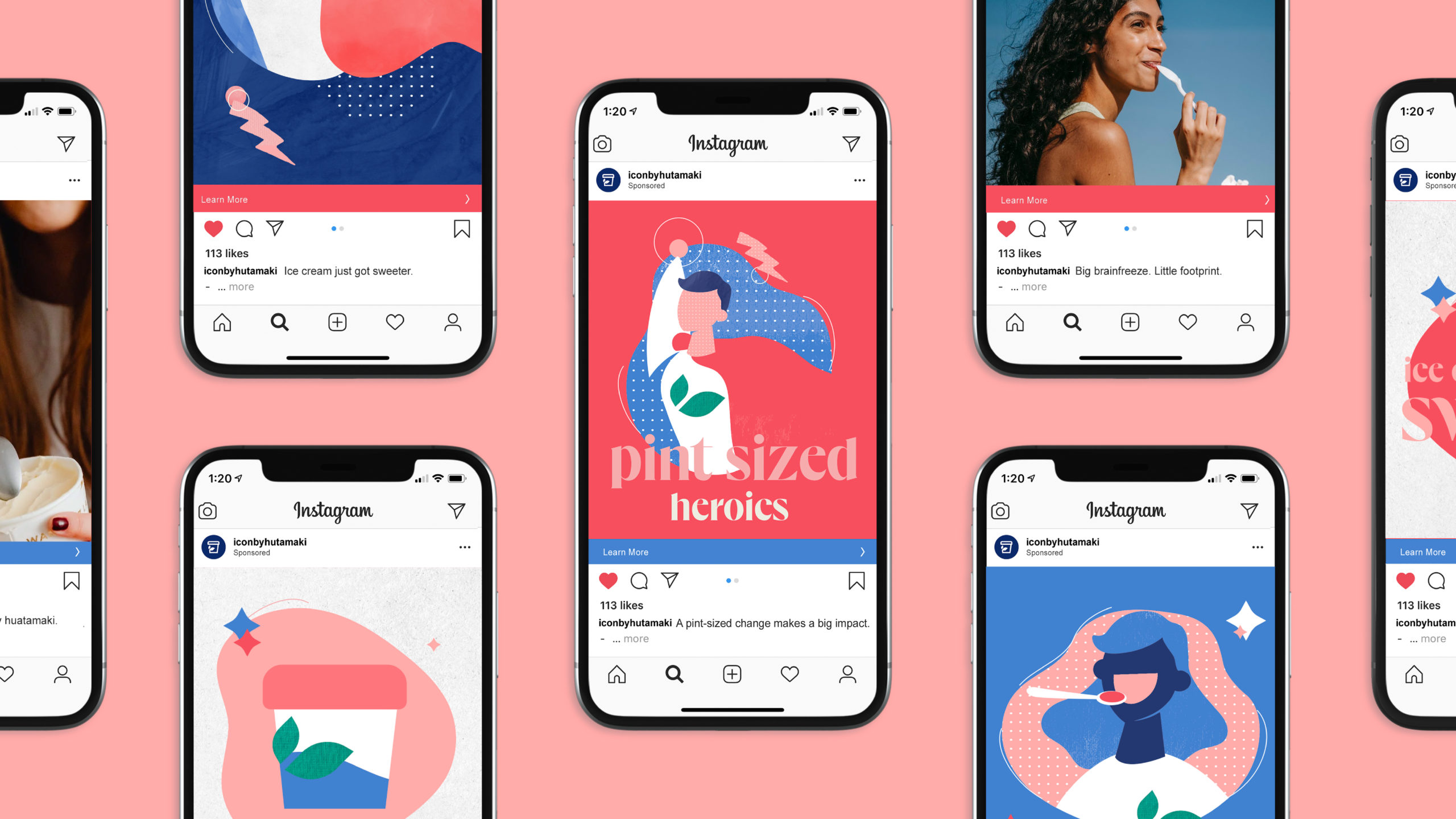
Bringing the joy of innovation to market
A bold innovation deserves bolder messaging and visuals. That’s exactly what we delivered. Our illustrations paired playfulness with a comforting sense of familiarity. Our brand voice was designed to demonstrate the wonder that everyone associates with ice cream.


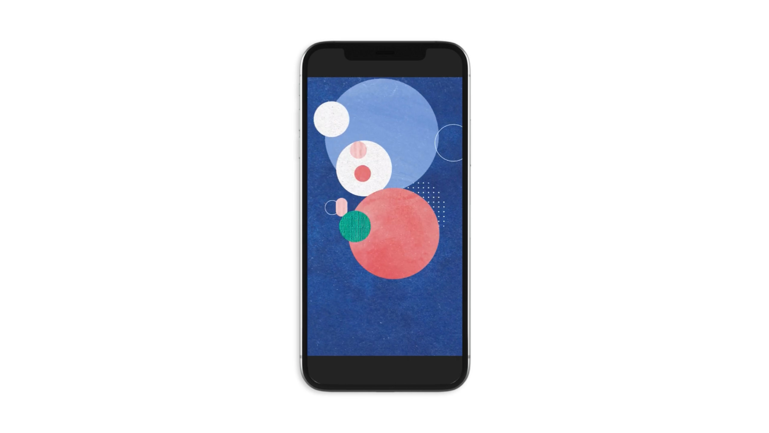
Meeting buyers where they live – on their phones.
Triggered exclusively by a QR code, potential ICON® buyers were driven to a mobile-first experience that showcased the overall mission of the brand along with all the granular details that made this product truly one-of-a-kind.
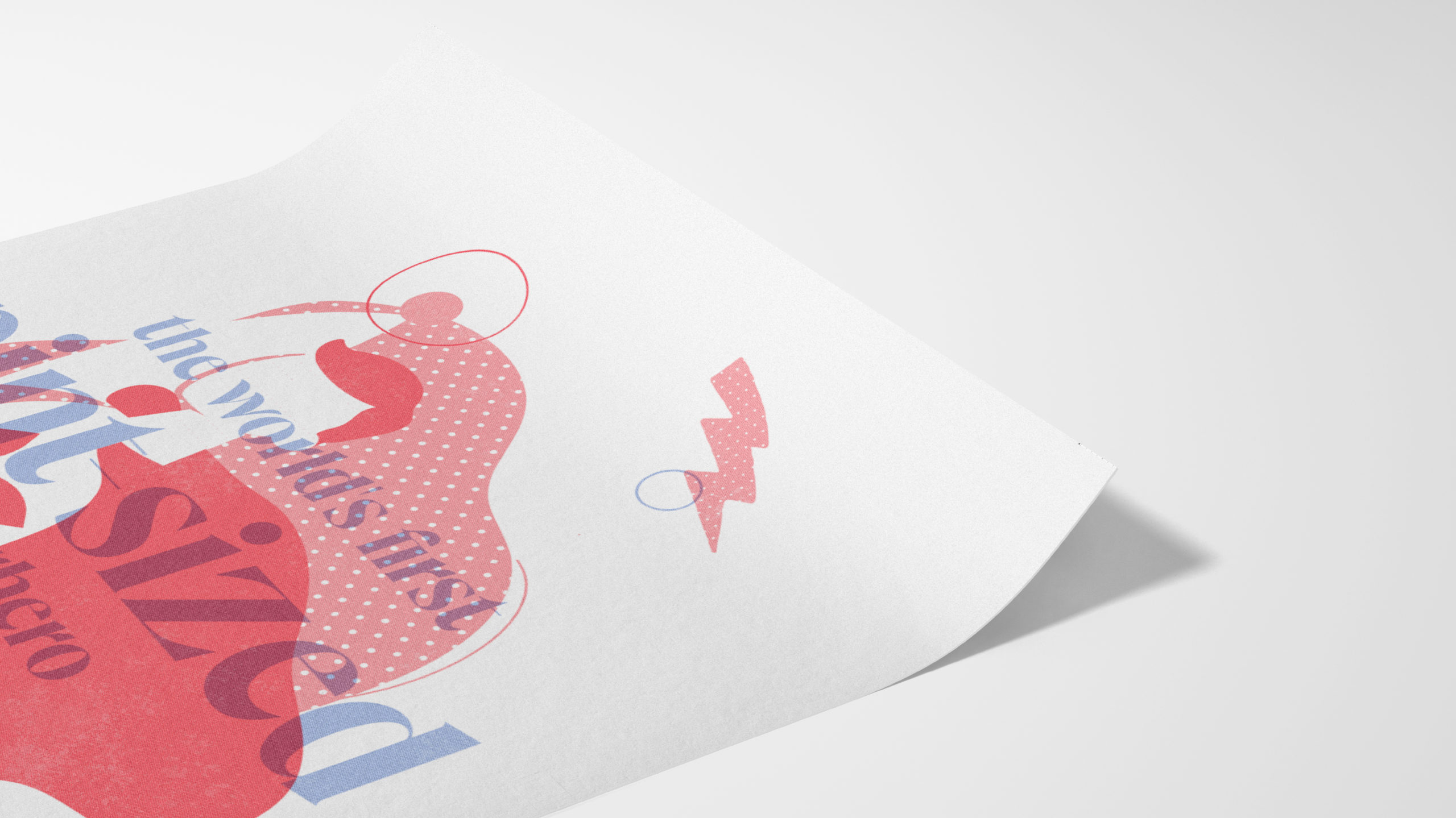
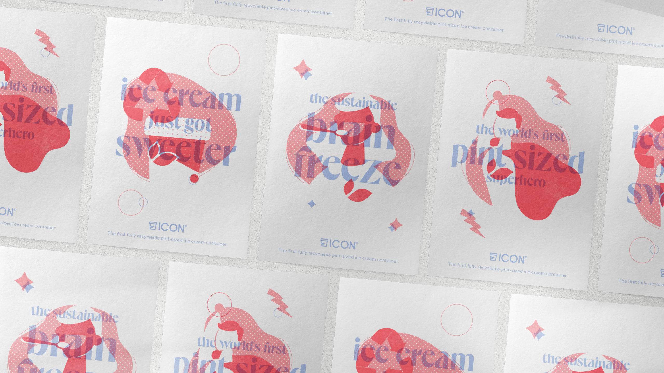
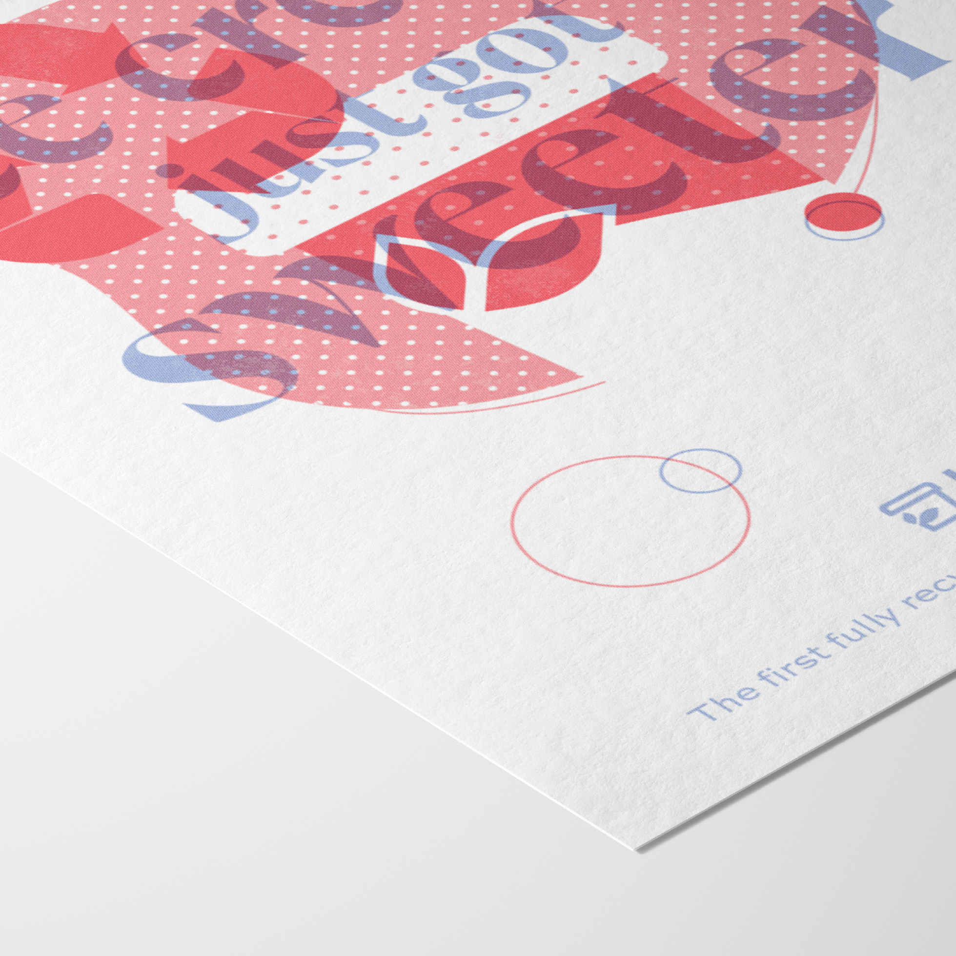
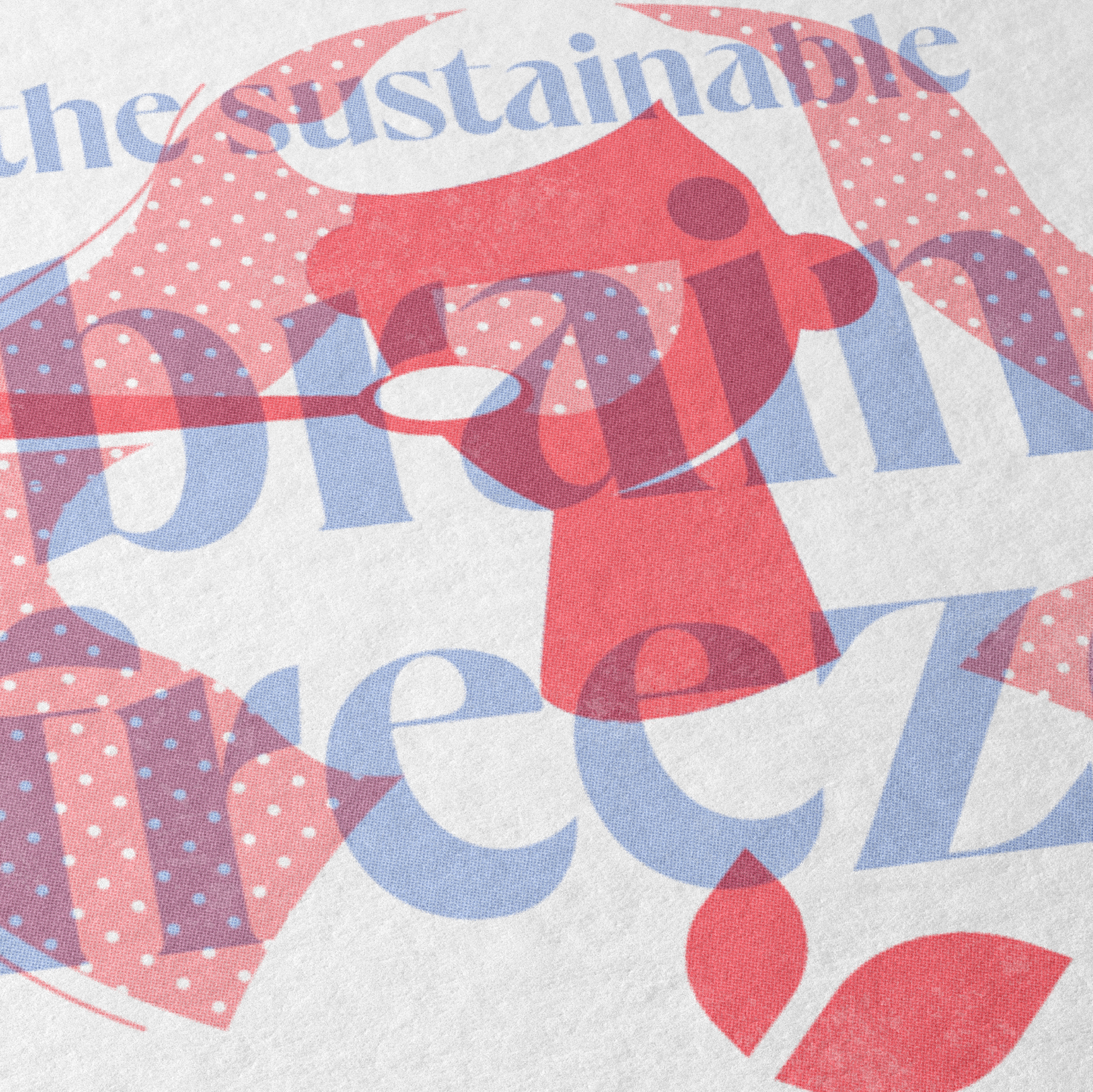
A signature poster series.
To celebrate the launch of the product, MBB created a series of three risograph prints. The technique accomplished exactly what we wanted – it highlighted all the energy and details that went into the launch of this brand.
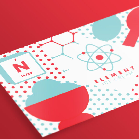
Element Ice Cream
Branding VIEW